Three things every AR designer should know
As more developers and designers are starting to use Augmented Reality for their projects, I felt that it is time to talk about the meeting points between Augmented Reality, human interaction and UX design.
Before we look at the details let me utter a small warning. In this article, I am mixing the concepts of developing a mobile AR application and designing an AR experience a few times. This is because these principles mostly apply to both scenarios and can be interchanged.
Onboarding the user
AR is a relatively new technology and many users are interacting with it for the first time. Due to its novelty, a common standard on how users expect things to work hasn’t really emerged yet.
That’s why it is very important to onboard users and make them understand how to use the application or how to interact with the scene. Onboarding slides at the beginning of a scene, or when using an app for the first time, explain concepts like pinch to scale, twist to rotate and drag to move. Users already know these concepts from other applications, but it is important is to set expectations right.
Understanding the environment
The first challenge of any AR experience is for the software to understand the environment. This includes detecting surfaces and also the position of the user, relative to the detected objects and surfaces.


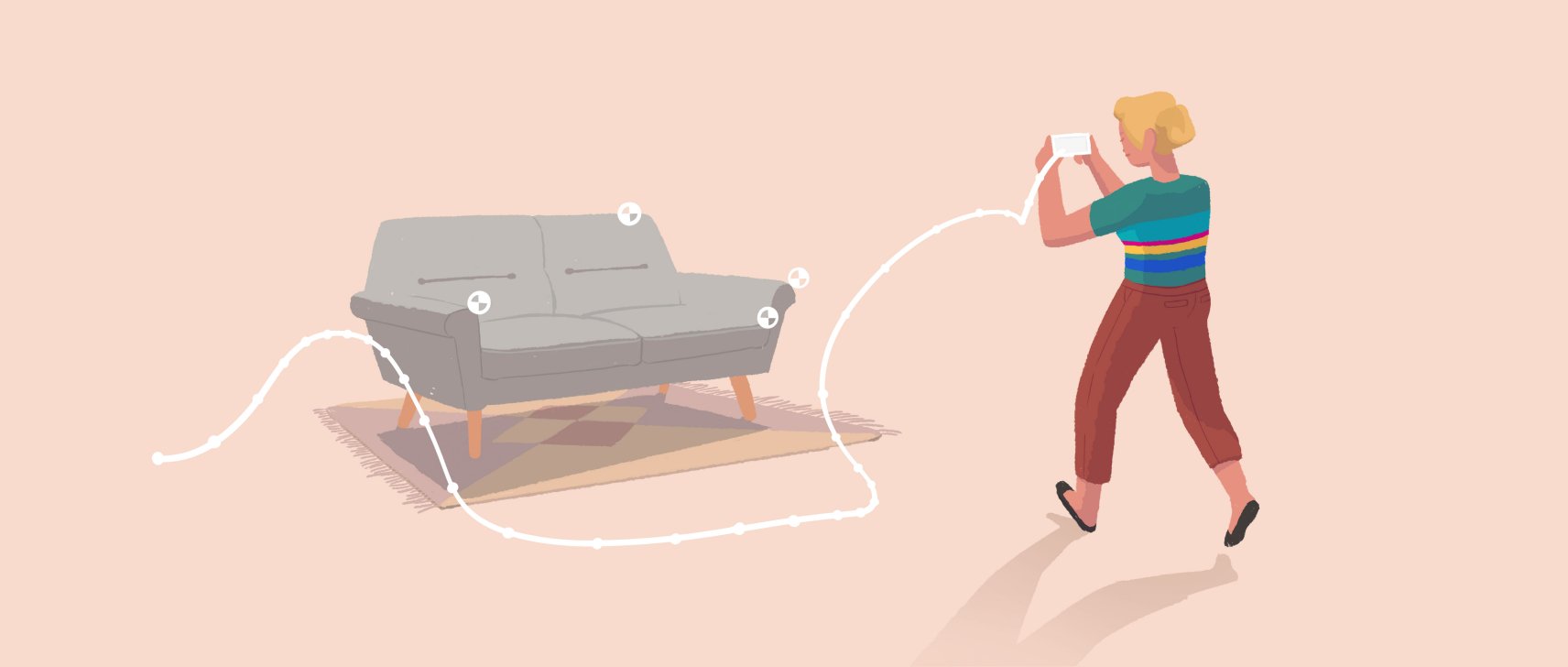
In order for an AR application to understand the environment, the users are usually asked to move their mobile device around. This is very similar to how we as humans understand our environment, except for that we have two eyes and a head that we can move around.
Looking at a smartphone and applying the same paradigm – it only has one eye – its camera and it can’t move around by itself. So the user needs to help the device to understand the environment, in particular, depths and surfaces before it can start the AR experience.
Understanding the user’s movement and the available space
Another important aspect when designing an AR application is to consider the user’s movement and how much space is needed for the experience to scale objects to a certain size. How big are objects compared to the user? Is an object visible at once or does it require the user to move around to see the object?


Every scene also needs a different amount of space, so the app needs to determine how much space is available and the designer of the scene needs to consider if this the content can be placed on a table or if the user needs to go outside. Developers refer to this as ‘table scale’, ‘room scale’, and ‘world scale’. In this segmentation, world scale has no limits.
If the experience requires user movement, proximity is a good approach to trigger actions. If the experience is to be better to be enjoyed statically (e.g. complex information being displayed in a graph) the better approach is to make it scalable on the spot and avoid automatically triggered actions.
If you know feel inspired to design your first Augmented Reality experience, give Onirix Studio try!

